When customers visit your website with a question, a request, or a desire to connect, their journey often leads them to your Contact Us page.
This is your chance to offer a warm welcome, clear direction, and a seamless path to communication, turning casual visits into meaningful engagement.
In this blog, we’ll explore some of the best Contact Us page examples and practical design strategies you can apply to create a page that truly connects and converts.
What is a Contact Us Page?
A Contact Us Page is a section on a website where visitors can reach out to share feedback, offer opinions, and gather information about your business.
It helps customers quickly find the support or information they need whenever they contact your business.
A good Contact page design makes it easy for visitors to:
- Request a demo or ask about the product
- Reach sales or customer support
- Send feedback or report an issue
Having clear contact options such as email, phone, live chat, or a support form can make a big difference in how customers view your company.
Elements of a Contact Us Page
Avoid overcrowding your Contact Us Page with unnecessary information. Only include the key information without overwhelming your users.
The following are some of the essential elements that you can include to make your page attractive:
|
|
Note: The Contact Us Page should be easily accessible on the website. Typically, this means including it in both your main navigation and footer to prevent visitor frustration when trying to reach out.
5 Contact Us Page best practices
A well-designed Contact Us page serves as a critical touchpoint for prospective customers, partners, and users. Below are key practices to ensure your page is functional, brand-aligned, and encourages engagement.
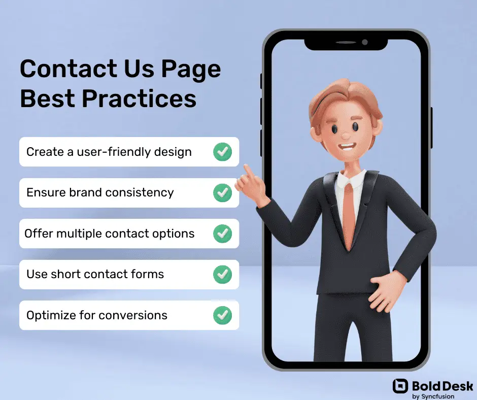
Create a clean and user-friendly design
A clutter-free, accessible layout encourages interaction and reflects your company’s professionalism.
How to implement
- Use a simple grid or column layout with a clear visual hierarchy.
- Keep content minimal and relevant; avoid excessive text or graphics.
- Ensure mobile responsiveness across devices.
- Highlight key contact elements (form, email, chat) with clear visual cues.
Ensure brand consistency across the page
Design and language should reflect your company’s tone and identity to strengthen brand recognition.
How to implement
- Use your brand colors, fonts, and visual elements consistently within the page.
- Match the tone of voice with your company’s personality (e.g., formal, friendly, technical).
- To build familiarity, incorporate brand visuals such as logos, icons, or background imagery.
Offer multiple contact methods
Different users have different preferences. Providing options ensures inclusivity and improves response rates.
How to implement
- Include a business email address and/or dedicated emails for support, sales, etc.
- Display phone numbers for teams or regions, if applicable.
- Add live chat for instant responses.
- Integrate links to your company’s social media handles.
- Use contact forms for structured queries or detailed requests.
Keep contact forms short and purposeful
Long or complex forms can discourage users from submitting inquiries.
How to implement
- Only ask for essential information: name, email, phone number, and a message.
- Clearly mark required fields to avoid confusion.
- Use dropdowns or checkboxes for faster completion where appropriate.
- Ensure the form is easy to use on both desktop and mobile devices.
Optimize for conversions
Your Contact Us page can do more than accept messages; it can support conversions and funnel interest.
How to implement
- Add a short, engaging welcome message that sets expectations and reflects a helpful tone.
- Use team photos, office images, or short videos to humanize your company.
- Include a strong, relevant call to action (e.g., “Request a Demo”, “Contact Sales”, “Get Support”).
- Reinforce your value proposition subtly, mention response time, helpfulness, or support quality.
21+ Best Contact Us Page examples
If you are thinking of creating or improving your Contact Us Page design, you are in the right place. This section covers the top designs to help you create a perfect one.
BoldDesk®
BoldDesk is a next-generation AI-powered customer support platform that streamlines ticketing, workflow automation, and service management for businesses of all sizes.
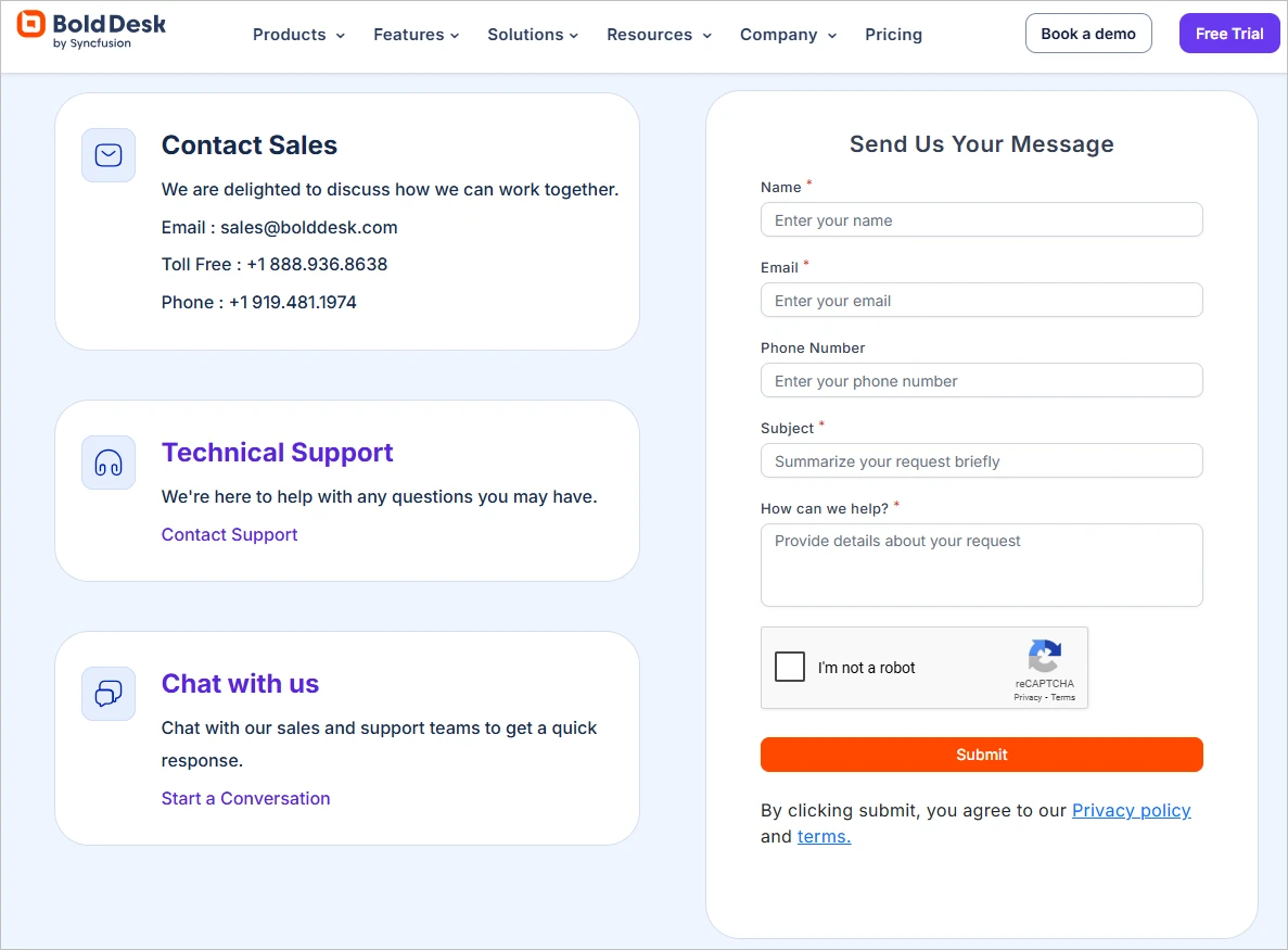
Its Contact Us page offers separate support channels for technical assistance, sales, and general inquiries while maintaining a clean, professional design that reflects its brand.
The inclusion of a toll-free number, multiple email addresses, and live chat gives users full control over how they engage.
Layered with reCAPTCHA for security and designed for ease-of-use, it’s a contact page that respects time while offering the human touch.
Furthermore, office locations are showcased visually, which adds credibility and global presence.
Apple
Apple is a global leader in consumer electronics and software, creating iconic products like the iPhone, iPad, and Mac, alongside services like iCloud and the App Store.
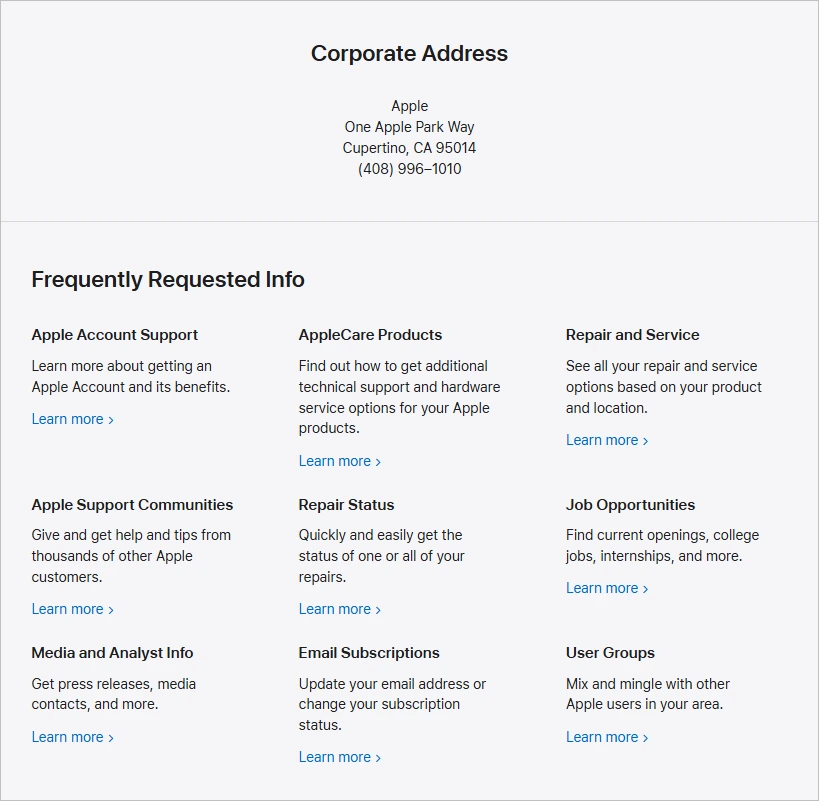
The Apple Contact Us page offers multiple ways to get in touch with Apple, including phone support, live chat, and in-person appointments at Apple Stores.
Users can get help with Apple products, check order status, manage subscriptions, or set up repairs. The page also includes options for business, education, government customers, and accessibility support, such as American Sign Language (ASL) interpreters.
American Express
American Express is a premier financial services brand offering personal, business, and corporate credit cards, as well as travel-related services.
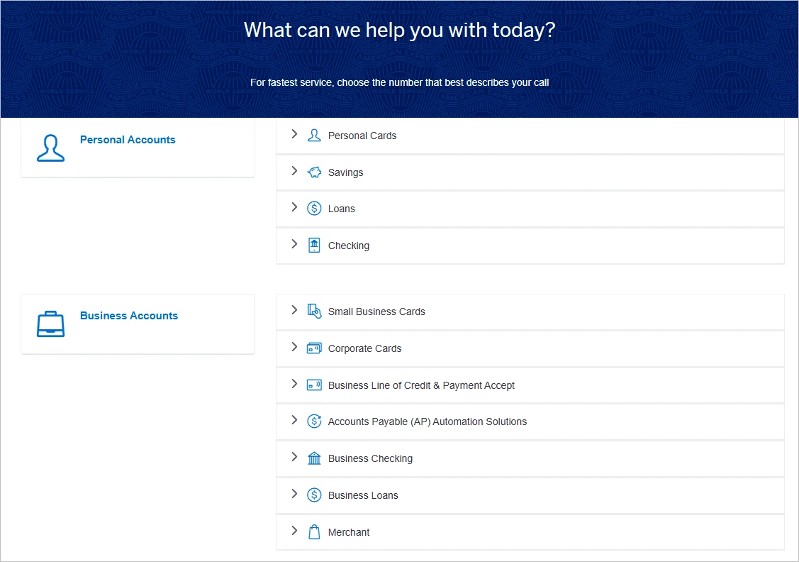
Their Contact Us page provides tailored support for personal, business, and corporate users through phone, mail, and secure chat.
It includes dedicated sections for financial products and services, with specific contact details for small business and corporate cardholders, including program and virtual card support.
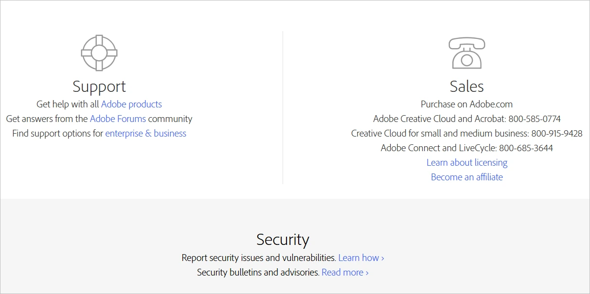
Adobe
Adobe offers industry-leading software for creative professionals, marketers, and businesses, including Photoshop, Acrobat, and Adobe Experience Cloud.
The Adobe Contact Us page offers support via phone, live chat, and email, along with access to a community forum for peer assistance.
It features a user-friendly layout with clear navigation, helping users quickly find the support option that fits their needs.
Walmart
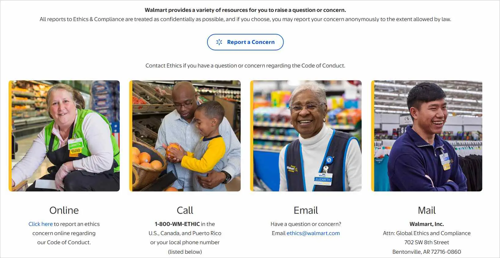
Walmart is one of the largest retail chains globally, offering a wide range of products through both physical stores and its robust online marketplace.
Their Contact Us Page provides a wide array of contact options, including phone support, live chat, and email, allowing customers to choose the option that best suits their needs for assistance.
Slack
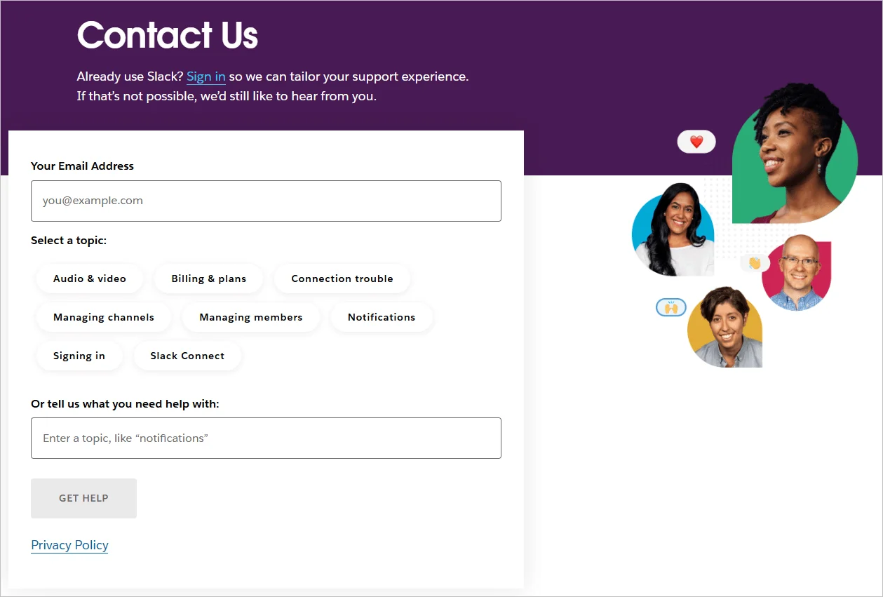
Slack is a collaboration platform designed for teams to communicate through channels, direct messages, integrations, and automation, streamlining workflows across companies of all sizes.
The Slack Contact Us page features a simple, accessible design, a contact form, and live chat for real-time support.
While phone support isn’t offered, users can access a detailed Help Center with articles and FAQs for quick customer self-service.
Shopify
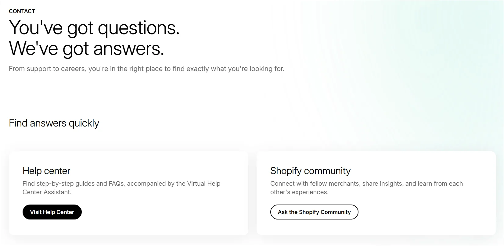
Shopify powers e-commerce stores worldwide, offering businesses a platform to build, sell, and manage their online presence.
Its Contact Us Page features a comprehensive Help Center with articles and FAQs, alongside vibrant community forums for peer-to-peer assistance.
The mobile-optimized, intuitive design ensures easy navigation, reflecting Shopify’s commitment to accessible, global support.
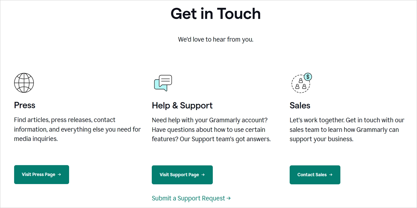
Grammarly
Grammarly offers AI-powered writing assistance tools that correct grammar, improve clarity, and elevate tone across emails, documents, and online writing platforms.
The Contact Us page features several support sections, including those for press inquiries, articles, help & support, and sales.
They can also submit support requests for account-related questions and reach out to the sales team for business collaborations.
Dropbox
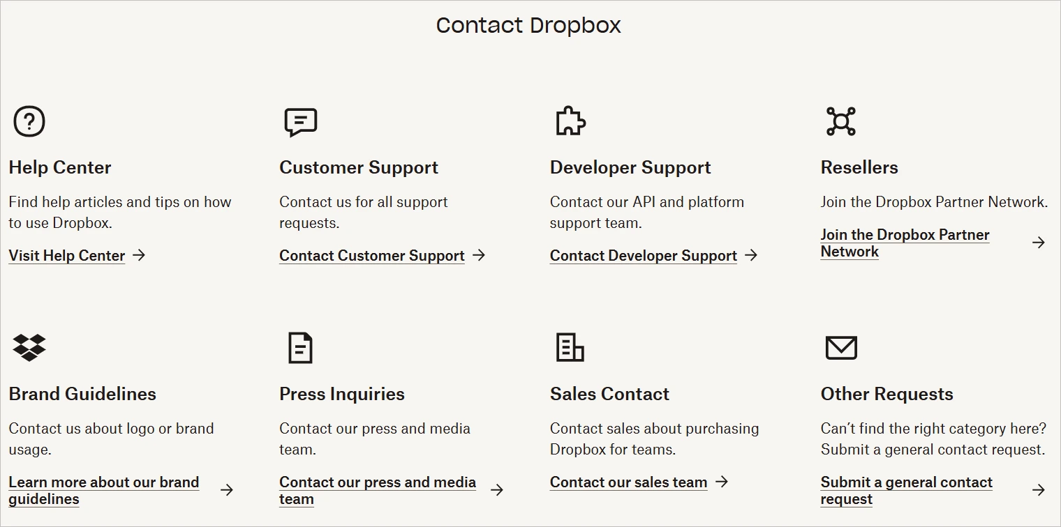
Dropbox provides cloud-based file storage and collaboration tools for individuals, teams, and enterprises.
Its Contact Us page features an organized layout with a distinct icon for each support section, making it easy for users to find the right support team.
Calendly
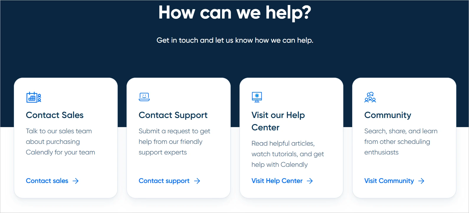
Calendly is a scheduling automation tool used by individuals and teams to simplify meeting coordination.
The Contact Us Page directs users through a structured help center with distinct paths for support, community forums, and sales inquiries.
Users can access email-based support for technical issues, with priority response times for paid plan users. The page includes links to the help center, developer documentation, and an embedded chatbot for troubleshooting guides.
For sales-related questions or demo requests, a separate form routes inquiries directly to the sales team.
Nike
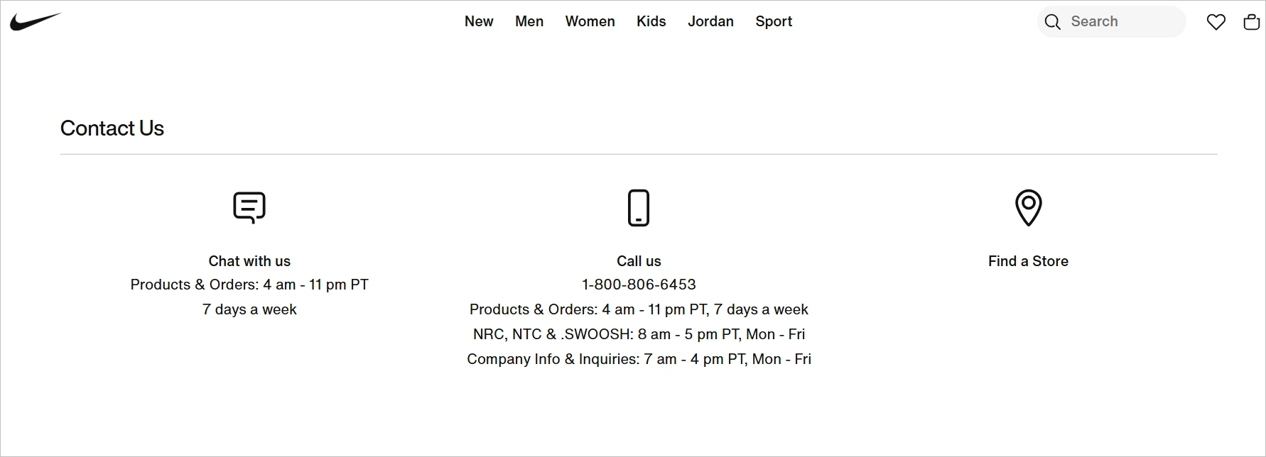
Nike is a global sportswear brand that designs and sells athletic apparel, footwear, and equipment.
The Nike Contact Us page provides 24/7 live chat, a toll-free number, and social media customer service.
It includes dedicated sections for orders, returns, product info, and membership, along with region-specific support based on user location.
JetBlue
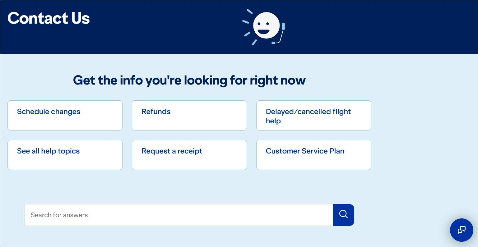
JetBlue is a U.S.-based airline offering low-cost flights with a focus on customer experience and onboard amenities.
Its Contact Us page offers support via phone, live chat, and text messaging, with dedicated lines for flights, baggage, and group bookings.
It also includes a searchable help section and a virtual assistant for common travel questions.
Salesforce
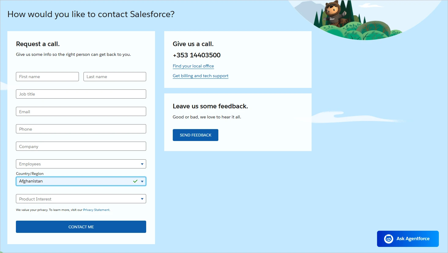
Salesforce is customer relationship management (CRM) software that provides cloud-based solutions for sales, service, and marketing.
Their Contact Us page provides separate contact options for sales, support, and specific products, including a form and toll-free number.
It also features regional office contacts and a directory for developers, partners, and community support.
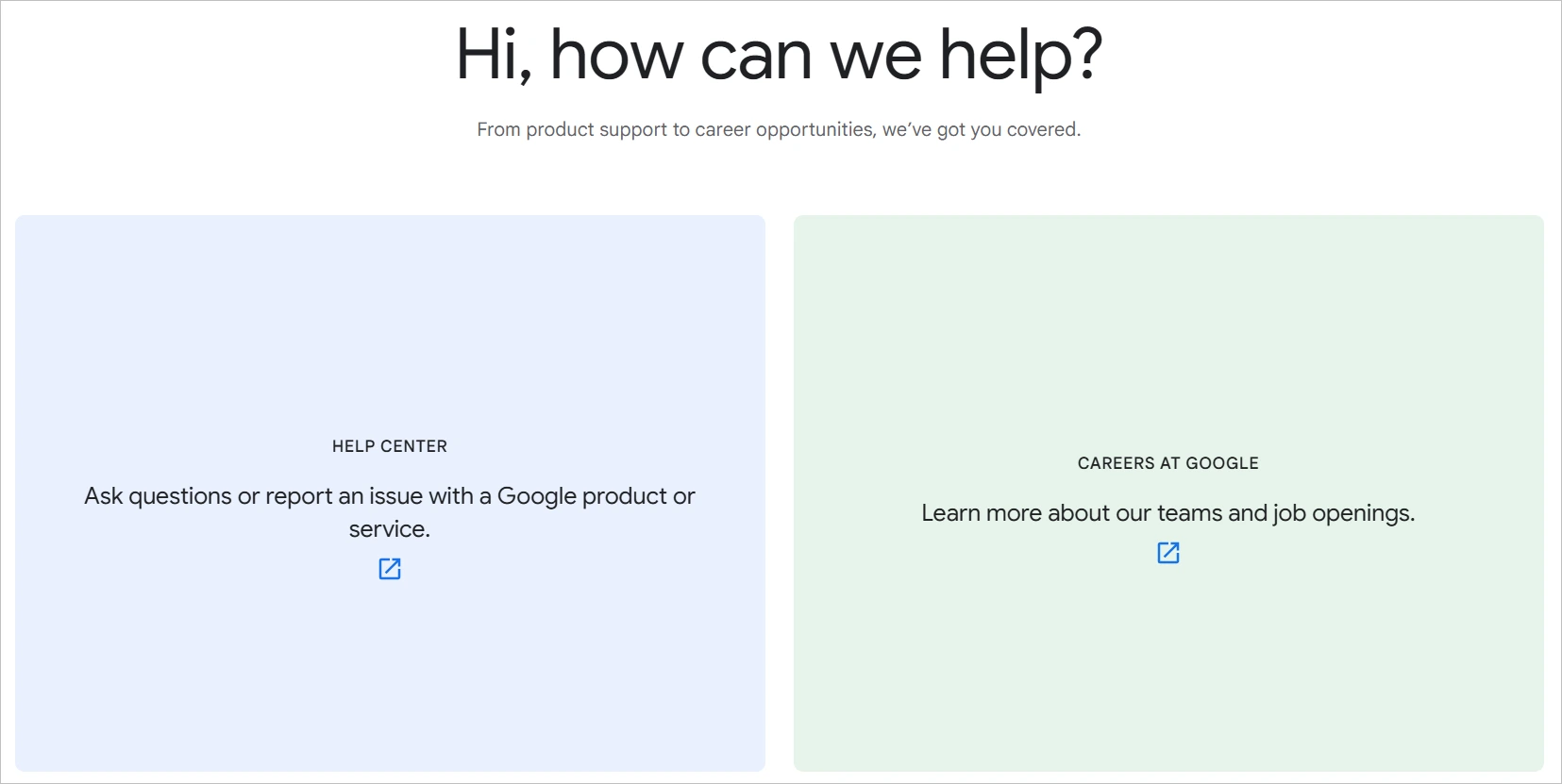
Google is the world’s most-used search engine and tech company, offering products ranging from Gmail, Google Ads, and Workspace to Android, Maps, and AI infrastructure.
Its Contact Us page guides users to product-specific help centers, including Google Ads, Workspace, and Cloud. Users can easily find self-service articles, community forums, and AI-assisted help based on their preferences.
The page also includes a directory for press, legal, and business inquiries.
Microsoft
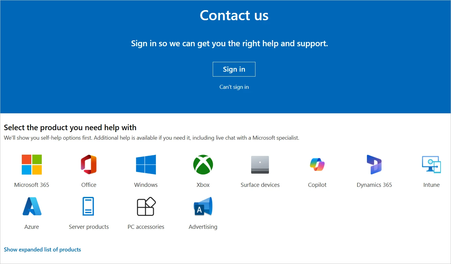
Microsoft is a global tech giant offering Windows, Office, Azure cloud services, and more.
The Microsoft Contact Us page offers dedicated support for consumers, businesses, and developers through live chat, phone, or virtual agent.
It covers products like Microsoft 365, Xbox, Windows, Azure, and Surface, with signed-in access to the support portal. Additional links are provided for feedback, accessibility, and compliance inquiries.
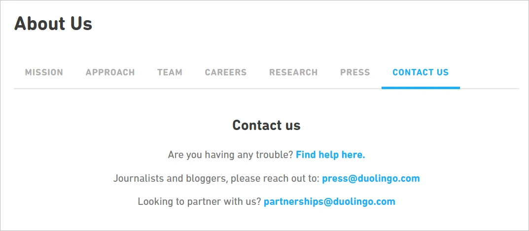
Duolingo
Duolingo is a popular language-learning platform using gamification to help users learn over 40 languages.
Its Contact Us page focuses on self-service through a Help Center with FAQs on subscriptions, technical issues, and classroom tools.
Contact forms are available for billing and account issues, but phone and live chat support are not offered.
The page also includes a press contact form and links for reporting bugs or ethics violations.
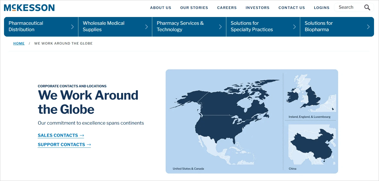
McKesson
McKesson is a healthcare services and pharmaceutical distribution company, providing products, technologies, and logistics to medical facilities.
The McKesson Contact Us page offers phone numbers and emails by department, including media, supplier, and investor support.
Healthcare providers have dedicated lines by service type, and a login portal allows access to account-specific help.
Sales forms and emergency contact details are also provided for critical services.
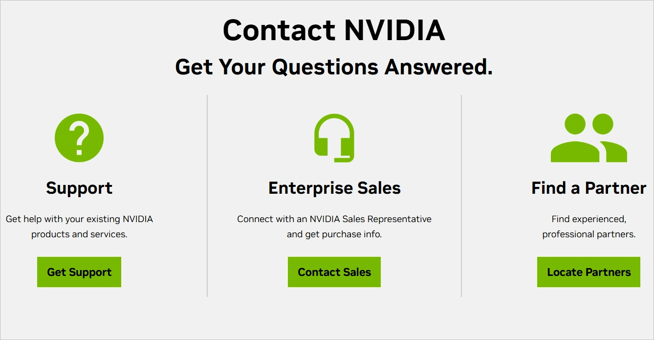
Nvidia
Nvidia is a leader in graphics processing units (GPUs), AI hardware, and deep learning software for gaming, data centers, and autonomous systems.
The Nvidia Contact Us page directs users by product category, such as GeForce, enterprise, or developer tools. It links to a support center with driver downloads, a knowledge base, and a community forum.
Business and media inquiries are handled through separate forms and contact emails.
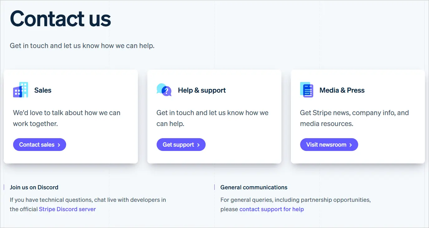
Stripe
Stripe is a leading financial infrastructure platform that helps businesses accept payments, manage revenue, and scale globally.
The Stripe Contact Us page provides 24/7 chat, email, and phone support for logged-in users through the Stripe Dashboard.
Non-users are directed to a help center and guided to contact forms for sales, support, media, or partnerships.
It also includes a separate portal for reporting fraud, phishing attacks, and contact details for press, legal, and compliance matters.
AT&T
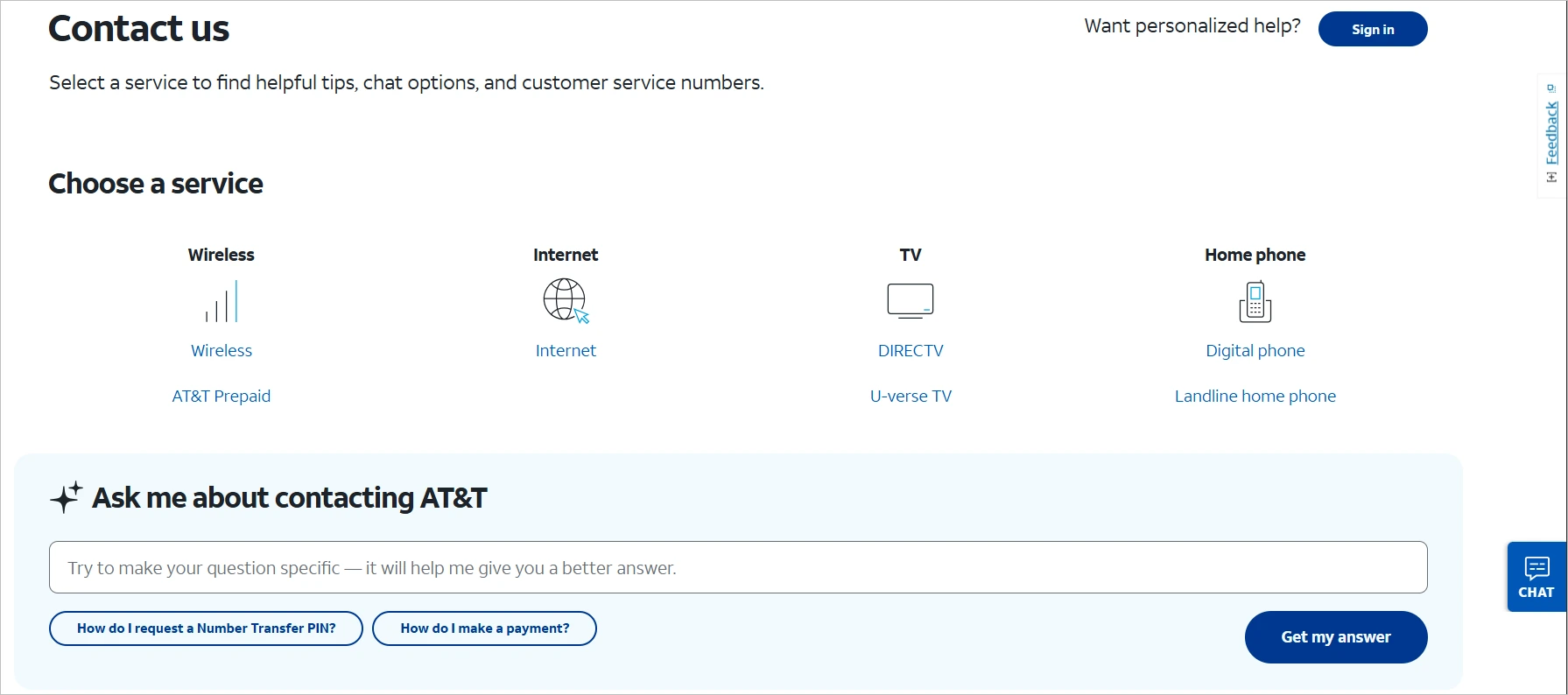
AT&T is a multinational telecommunications provider offering wireless, internet, and TV services.
Their Contact Us page provides segmented support for wireless, internet, TV, and business services.
Users can reach support via live chat, phone, or community forums, with options varying by product and location.
It includes self-service tools for billing, outages, and troubleshooting, and offers a separate portal with customized support for business customers.
Chewy
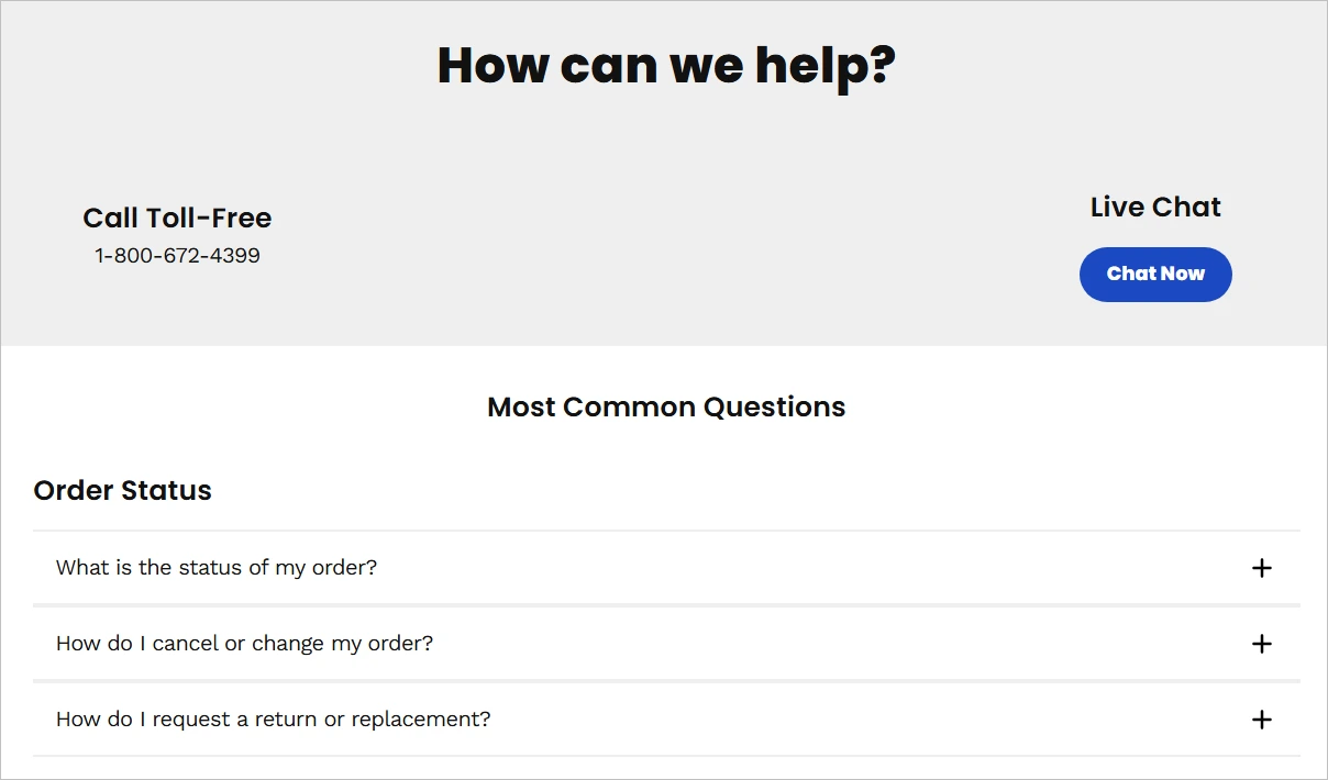
Chewy is an e-commerce company specializing in pet food and supplies, known for excellent customer service.
The Chewy Contact Us page offers 24/7 customer service via toll-free phone, live chat, and email, with quick links for orders, returns, pharmacy, and pet prescriptions.
It includes a detailed FAQ section, but prioritizes direct human support through their live chat. Contact info is clearly displayed and accessible without requiring login.
Mailchimp
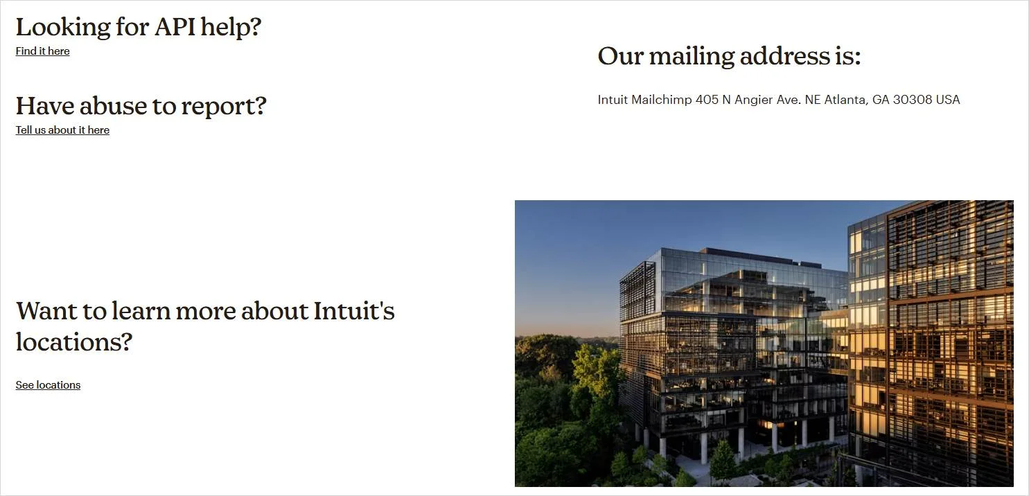
Mailchimp is a leading email marketing platform that helps businesses manage campaigns, automate outreach, and grow audiences.
The Mailchimp Contact Us page directs users to their help center, which includes tutorials, how-to guides, and a smart search tool.
The page includes links to billing assistance, account recovery, and compliance questions, while business inquiries, partnership, and press requests are handled through separate contact forms.
Improve customer relations with an accessible Contact Us Page
A well-crafted Contact Us Page is your brand’s open door to meaningful customer connections. By making it easy for visitors to reach out, you demonstrate trust, reliability, and a commitment to excellent service.
Design, clarity, and simplicity are key roles in creating a seamless user experience. Don’t let a poorly structured page turn away potential clients or valuable feedback.
For businesses ready to take their customer communication to the next level, BoldDesk is a comprehensive help desk software that seamlessly integrates with your contact options to ensure no customer inquiry goes unanswered.
Did you find this post insightful? Let us know in the comments section below.
Related articles
- Customer Communication: Everything You Need to Know!
- Business Requirements Document: Best Tips and Templates
- How to Use Slack for Customer Service Excellence
Common Contact Us Page FAQs
Let’s look at the available FAQs that you can use to have a better understanding of Contact Us Page designs:
Yes. A Contact Us Page provides customers with personalized directions to reach out to your business.
It’s also a way to prove to your customers how committed you are to serving them, thus building customer trust.
First impressions count, so the Contact Us message must be attractive and professional. You can use the following in addition to Contact Us:
- Send us a message
- Let’s connect
- How can we help you?
- Talk to us
- Get in touch
- Let’s talk
- Do you have any questions?
- We’re here to help
A “Contact Us” page shows your business is accessible, responsive, and customer-focused. This page strengthens credibility, allows easy communication, builds trust and boosts conversions.
