A knowledge base is of no use unless individuals can locate the appropriate information, comprehend it, and apply it to their queries. The first impressions of 94% of website users are influenced by the website’s appearance.
Undoubtedly, visuals greatly enhance the allure of a webpage or website. However, what role does design and visuals play in a knowledge base? In this blog, we will look at techniques to improve your knowledge base design and visuals.
Tips to improve your knowledge base design
An effectively designed customer-facing knowledge base, utilizing self-service tools, can revolutionize a brand’s image. When designing a knowledge base website, visuals are an important aspect to consider.
To find out more on best practices to improve your knowledge base, read this blog.
Here are some visual design techniques to consider:
1. Concentrate on the design aspect
In the realm of self-service tools, how can one define exceptional design? It ultimately boils down to the absence of friction. A design with minimal friction allows users to seamlessly benefit from a product.
Consider the needs of your customers and choose a design that aligns with their requirements.

Your customers desire quick answers, and it’s your responsibility to ensure they get them. To achieve this, you can:
- Incorporate a prominent knowledge domain search for users to instantly locate the information they need.
- Include links to your most popular articles on the homepage to prevent customers from navigating away immediately.
By doing so, customers receive the answers they seek without sacrificing visual appeal.
2. Your knowledge domain should be quick to load
One factor that can deter your customers is the inability to view certain sections of an article.
According to Go-Globe, 39% of individuals will cease engaging with a website if images wont load or take too much time to load. Ensuring a quick load time involves optimizing various elements such as:
- Using appropriate file formats: When it comes to images and other media, choose the right file format.
- Optimizing image size: Large image files can significantly slow download times. Resize and compress images to reduce their file size without compromising on quality.
As users, we understand that each second spent waiting online can feel like an eternity. Therefore, confirm that your site loads as quickly as possible.
3. Ensure your knowledge domain is device-compatible
Your knowledge base software must cater to users accessing it from various devices, such as smartphones and tablets.
It is essential to enable your customers to self-serve from any location, and for this reason, ensuring your site displays accurately on different devices is crucial.

A responsive knowledge base design provides an enhanced user experience regardless of whether a customer is using their laptop at home or browsing on their smartphone.
Furthermore, search engines rank sites with responsive designs higher than those without them.
4. Design to enhance readability
When creating the appearance of your articles, it is essential to optimize them for readability, ensuring that users can easily comprehend your content.
Large blocks of text may deter users, so it is crucial to utilize an appropriate font size and break up the text using bullet points, numbered lists, headings, and other formatting techniques.
It is also essential to:
- Ensure that there is sufficient spacing between lines of text to prevent them from appearing too condensed.
- Refrain from using all capital letters in your articles, as it can be challenging for some individuals to read.
- Avoid underlining text within your content and reserve this formatting method for links.
5. Ensure your knowledge center is interactive
It is essential for your knowledge base articles to engage with your clients. An interactive self-service tool can significantly improve user experience and engagement by providing visually appealing and easy-to-navigate content.
You can practice the following to make the self-help center more interactive:
- Use interactive elements such as quizzes or surveys to engage users and push them to interact with your articles. This can help reinforce learning and keep users interested in your content.
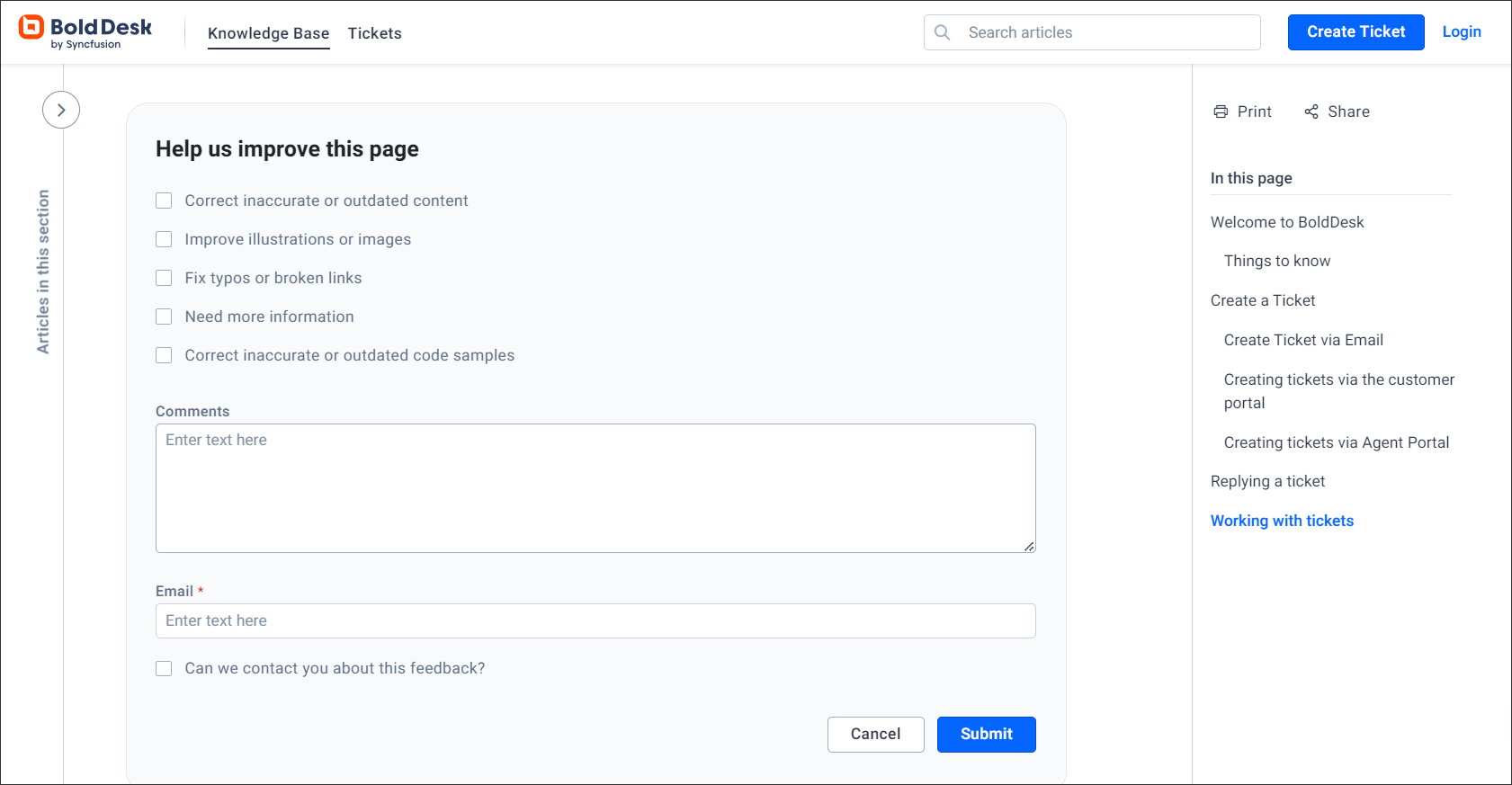
- Motivate users to share their opinions regarding your knowledge center content and use their suggestions to make improvements. This can assist you to identify areas where your content may need to be more interactive or visually appealing.
6. Incorporate visuals in your self-service tool
A picture holds the value of a thousand words, which is especially accurate in knowledge base software. Since individuals process visuals quicker than text, investing in this vital aspect of your design is advisable.
Optimize your articles by incorporating visual components like images, videos, and screenshots to cater to various learning styles.
To optimize the influence of your knowledge center, it is essential to incorporate relevant and captivating visuals that enhance your material.
7. Ensure that your knowledge center is in line with your company’s brand
Your website architecture needs to be designed with purpose, ensuring that the structure of your knowledge domain complements the information it contains.
This involves maintaining visual consistency with other sections of your site and aligning the copy within the knowledge center with your overall site copy and brand tone.
Elements such as UX design, tone of voice, grammar, and visuals should all represent your brand and feel intuitive to the customer.
Possessing a comprehensive understanding of your intended audience will make this aspect of the process more manageable.
Benefits of design in your knowledge base software
What roles do designs play in a knowledge base?
a. Designs embody your brand’s persona
The appearance of your knowledge base establishes your company’s identity.
b. Improved design enhance the knowledge domain experience
By providing better design representation, organization, and navigation within the knowledge base.
c. Boost the authenticity of your message
Ensuring that your knowledge center aligns with your company’s branding guarantees that your customers recognize it as the official knowledge base.
d. Transmit information more quickly
Undoubtedly, information presented in bullet points is easier to comprehend. However, when the same information is conveyed through images or videos, it is processed even more rapidly.
e. Enhance the retention of information
People remember information better when it is presented visually rather than in text.
f. Simplify complex information
Designs can help break down complex ideas and concepts into more easily digestible formats. By simplifying complex information, designs can make the knowledge center more accessible and understandable to a wider audience.
g. Designs are engaging and attention-grabbers
The design appeal of your knowledge center plays a crucial role in capturing the user’s interest.
Conclusion
Overall, the design of your knowledge base should be user-centric, visually appealing, and easy to navigate. By incorporating these knowledge base design techniques, you can design a knowledge domain that is informative, engaging, and effective.
BoldDesk provides the best help desk software with the best knowledge base design to enhance user-friendliness. Register for a free trial to explore its potential for your team.
The BoldDesk support team is constantly ready to assist with any inquiries.
To see how BoldDesk can be customized to suit your business requirements, kindly reach out to us to arrange a live demo.
Related articles


